

Better forms can lead to increased conversion rates. People don’t want to jump through unnecessary hoops. Complicated or redundant forms can cause someone to bounce without filling out the form. However, if your brand can offer straightforward, thoughtful and well-designed forms, you build trust by showing you value your audience’s time.
You put a lot of time and effort into your website design for a long-term growth strategy. The wrong setup will have too many unnecessary expenses and frustrated participants. Your forms should be a natural extension of your site—providing professional cohesion and collecting data without becoming a burden.
Make sure your fields are clearly marked and your wording isn’t confusing. If the audience is confused at first glance, they have to work harder to fill out your forms. The more simplified and painless your forms, the more likely people are to start and finish filling them out.
On your forms, only ask for what you really need, including the information important for your goals. Too many fields will make filling your form seem overwhelming and too time consuming. To minimize your fields, consider what goals you have set for conversion and stick to only the fields needed to accomplish your plans.
Ideally, you should use smart forms which will autofill information (e.g., name, email address, phone number, etc.) you already have in your database on the person filling out the form. With smart forms, your audience doesn’t have to do as much and is more likely to participate. It’s also a good idea to use auto-fill browsers that will allow them to fill in common fields with just one click, pulling information based on previous activity.
It’s okay to have some fields optional, though they can add to the overwhelming look of your form (so, be careful!). There might be times when a detail might not be relevant to everyone, and you can leave the field as optional.
Only require information in fields you absolutely must have to create their customer file. While their name and email address might be required fields, the phone number and company name can be left optional in case that seems too personal to someone. Use an asterisk (*) to show which fields are required.
People typically look for the label directly above the input field or to the immediate left. Ideally, your form will be only one column because those are easiest for people to process and keep flowing through. Always keep the labels close to the fields so it is clear which applies to which.
Include placeholder text where it makes sense to help your audience immediately understand what you are asking for. You can show examples of email addresses and phone numbers to help speed up their form-filling process. It’s actually better to include the placeholder text next to the label or below the field instead of allowing it to go within the field and disappear when someone starts to type.
Put things in an order that makes sense to your audience—not just your CRM files. For most people, it would seem weird to provide a phone number or mailing address before entering their name.
Also, use headers to help break up segments of your form for easy consumption. You can use field focus to help set apart the box with a border or shadow to help it grab your audience’s eyes as the place to start.
It’s a great idea to keep your form short and simple. However, sometimes more information is needed, and multiple steps are required. If your form is longer, a progress bar at the top is a quick way for the user to know how far they are into your form.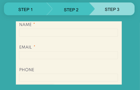
Your forms need to handle mobile traffic with ease. If you aren’t already using a mobile-friendly responsive design, it’s time to update your site! Your website should automatically shift to accommodate screens of all sizes.
Without a mobile design, users are left to pinch and scroll just to navigate the page. In some cases, forms that aren’t mobile responsive won’t load correctly and allow users to use the popup forms on higher levels.
Do you need a team of experts to help you navigate modern web design and form creation? At Strategic 7 Marketing, we are a full-service marketing and digital firm. Our outsourcing solutions make it possible for small businesses to keep up with the competition and scale without being too overloaded. Contact Kimberly Munch today at kmunch@strategicseven.com, or contact us here and let’s talk about how effective form setup can help boost your website conversions.


.png "Hubspot Partner Logo (ID 151409)")