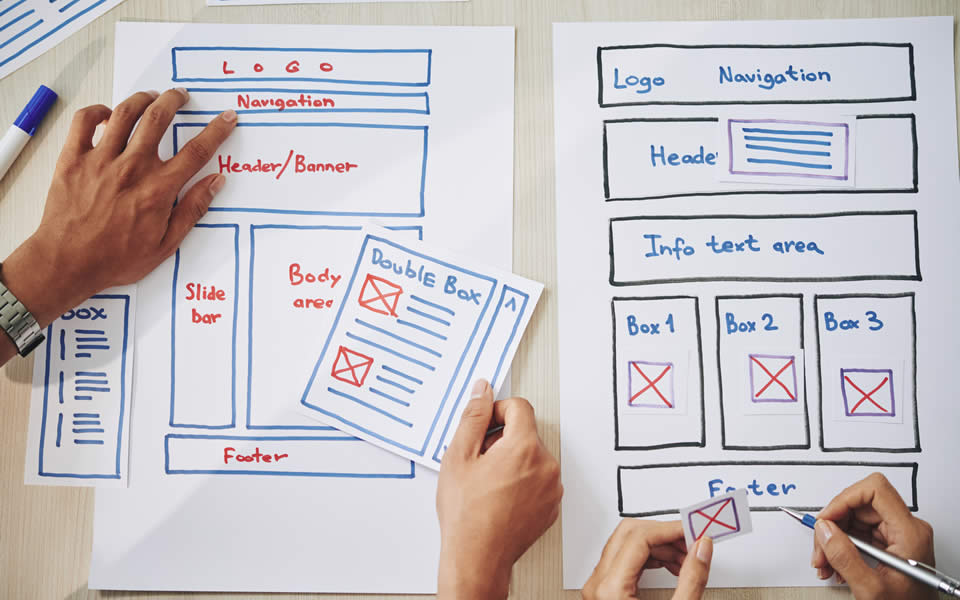

Website navigation is a large component of the overall user experience. It allows visitors to move around your website to find the information they are looking for and to take action to achieve their desired outcomes. Having an intuitive and easy-to-navigate website can improve website traffic, increase website conversions and improve your overall brand perception. On the other hand, a hard-to-use website that has a poorly thought-out navigation structure can decrease traffic, hinder conversions and force your user to look elsewhere on the web—never to return!
76% of consumers say the most important factor in a website's design is, "The website makes it easy for me to find what I want."*
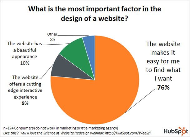
*Source: HubSpot
The average prospect spends just 6.48 seconds interacting with a navigation bar. That’s not a lot of time to lead a user down their desired path. By prioritizing website navigation, businesses stand a far greater chance that users will have a positive experience and continue to interact with their website. If they don’t, they risk losing users who decide to leave the website before ever navigating off the homepage.
Below are a few navigation best practices to get you started on a better user experience.
Users don’t want to hunt for the information they need. They’re on your site for a reason (whether landing there directly or through search) and if they can’t find that information, they will search for it elsewhere. We can all agree that the number of businesses that can provide information, services or products is endless. If they can find what they are looking for more easily elsewhere – they will.
Making your main menu bar “sticky” can also improve the user experience. A “sticky” navigation bar follows the user as they scroll down the page, allowing them to quickly navigate to another area of the site without having to scroll back up the page to the main navigation. An earlier study found that sticky menus were 22% quicker to navigate.
When deciding on which words to use within your navigation menu, be sure to use terms that are clear and easy to understand. Using words that are overly creative or vague can make it frustrating for the user to quickly and easily find what they are looking for. Also, it’s important to do your homework to understand what the top-visited pages of your website are. Utilizing website analytics will allow you to gain user insights and help determine what pages are most important to them—those should be front and center within your main menu.

The hamburger menu, named for its resemblance to the food, is the button sometimes placed at the top of a website that, once clicked, displays the main menu. A resounding 88% of websites have their main navigation located in the header at the top of every page – making traditional horizontal navigation the standard for desktop menu design. One study by the Nielsen Norman Group found that when using a hamburger menu, discoverability is “cut almost in half by hiding a website’s main navigation.”
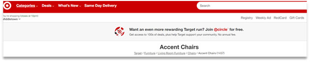
Efficiency is key when developing your navigation structure—the fewer clicks, the better. However, this is difficult to achieve with certain types of websites, such as e-commerce, where there may be numerous categories and types of products to choose from. Breadcrumbs become an important navigation feature as the number of “levels” of a website increases. Utilizing breadcrumbs signals to the user where they are on a site and gives them the ability to quickly navigate back to certain pages without having to click “back” in their browser multiple times. In the example below, Target breadcrumbs to specify various categories of its products.
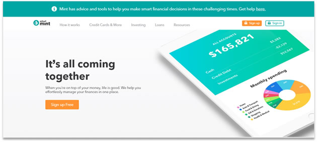
Call-to-action buttons prompt website visitors to take action and are key in converting these visitors into leads. To get the most out of your website, your CTAs need to be clear, concise and action-oriented. Using contrasting colors can help your CTAs stand out from other parts of your website. In the example below, Mint uses a bright orange color for its CTA buttons, making it easy for the user to locate them against the otherwise clean color palette of the homepage. In addition, the use of simple navigation in this example makes it easier for the user to locate specific information they are seeking.
The number of options you give the user will also hinder their ability to take action. According to Hick’s Law, the amount of time it takes to make a decision increases as the number and complexity of choices increases. Simply put, the fewer choices you give the user, the easier it will be for them to take action. The more options presented to the user, the more difficult it will be for them to take action, which could lead to site abandonment.
Uncompressed images can slow the speed of the website significantly, making the user wait longer to get to their “starting point” before navigating around a page. Ensure your images are optimized for the web.
A website is never done. Continually monitoring how users interact with your website is the best formula for success. Tools such as HotJar and CrazyEgg allow you to record user sessions to see how users interact and navigate your website. You’ll see their mouse movements, where they click, and gain valuable insight that will allow you to readjust the design of your website based on real user data.
The importance of prioritizing your website’s navigation should not be overlooked. Ensuring an understandable, clear and logical website navigation can do wonders for your website. Interested in learning more? Contact Sarah Chula at schula@strategicseven.com.


.png "Hubspot Partner Logo (ID 151409)")